Bad Photoshop
I use Photoshop. I love Photoshop. But Photoshop is not easy, especially if you are self-taught. When you first start using Photoshop, it has a thousand buttons and no way to really tell what any of them do. Teaching yourself to use it can be a steep hill to climb, and there are always more things to learn.
I always try to remind myself of that, when I see terrible Photoshopping. Because it is EVERYWHERE. And it bugs the fuck out of me. I can barely stand to look at some of these.
Photoshopping is not easy. People of the world-- You should hire an artist that specializes in it to do your photo editing. Not just some guy.
It irritates the FUCK out of me when people just assume that what I do is easy and that anyone could do it. No. Not true.
So, all that being said-- It's time to gaze in wonder on botched Photoshopping.
(Explanation for people who didn't do theater- Stage left is the actor's left when they are facing towards the audience. It's THEIR left. When we look at the someone facing us, their left is on our right. Got it? Ok.)
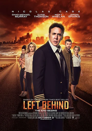
In addition to being just generally terrifying because it's a Left Behind movie with Nic Cage in it- look at the head placement. The head Mr Cage is currently sporting is not the one that photo had originally.
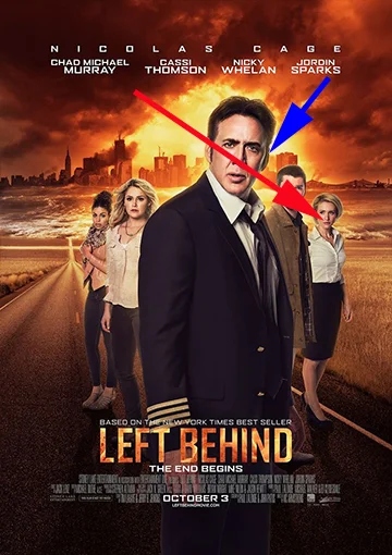
Because of the positioning of the body, the natural, relaxed eye line/head placement should have Nic looking in the direction of the red arrow. We should see his entire stage right ear and none of the left, where the blue arrow is pointing.
How do I know this? Because we can't see his stage left arm or shoulder at all. Just a little of the left hand.
Of course, it is possible to turn the head and look in a direction you aren't facing, but that involves twisting of the neck. The way the neck here is set into the collar- it's just wrong. That's not how his neck would look if is was naturally turning.
*Shudder* God. It gives me such a weeb to look at. The eye placement is off. It looks like he has a broken neck.
Want more proof? Check out this side by side comparison. (Also, why are there so many Left Behind posters?? It's too weird.)
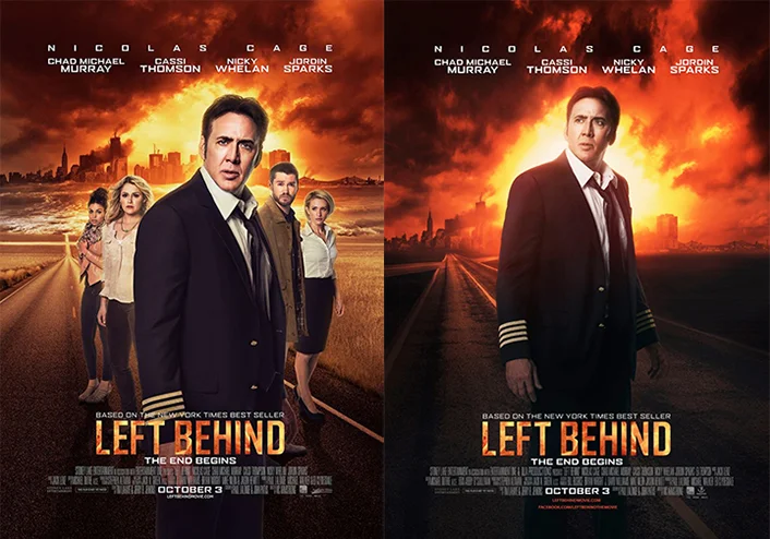
The second photo looks like Nic still has all his original body parts. The body on our left is not even turned quite so much, but we see much more neck because of the twisting the neck requires to look in a completely opposite direction as the one you are facing.
It's possible that the person who swapped out Nic's head was even using differently sized photos because the head also seems weirdly sized to me. Like it's a touch too big, maybe.
Ok, this next one is really bad.
Excuse me. I need to go lie down. Dear god. Where to even begin?
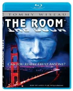
Let's do a side by side with the original movie poster, which is clearly the unaltered photo that now been slaughtered by Photoshop.
We're not even going to discuss the atrocious font or terrible use of mirroring on the text for no reason.
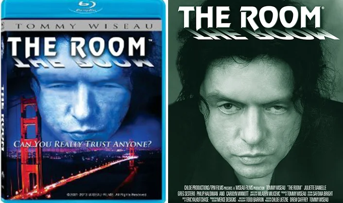
Ok, first of all. The blue layer over everything is appalling. (Blue for BLUE RAY? Dear god. Let's hope not.) It makes Tommy Wiseau look like a Smurf with a skin disease. It's been applied in a way that takes Tommy's normal skin texture and makes it look extremely pocked and uneven.
His hair has been blurred out/removed. It looks like the Golden Gate Bridge is puncturing his face, and the bridge does not look like it is not connected to the background in any way.
But the worst thing here is clearly the eyes. What in the holy name of fuck is happening here?? Copy and paste to make his eyes look more closed and then the blur tool just smearing his face and then whole thing looks like it's melting.
Dear lord. His whole face looks like something made out of wax that you left it in the car out in the sun in the middle of August.
The person on the right- human face. The person on the left- terrifying melted wax monster of doom.
Bad Photoshop. It's everywhere.